


Six Threads of the Embroidery Art Box
Guide on thread types, matte and metallic brushes, and color selection.

Hello! 👋
If you missed it, here's the post where we covered the basics of choosing primary and secondary colors, and which one should be active.
Six Threads to Rule Them All 🪄
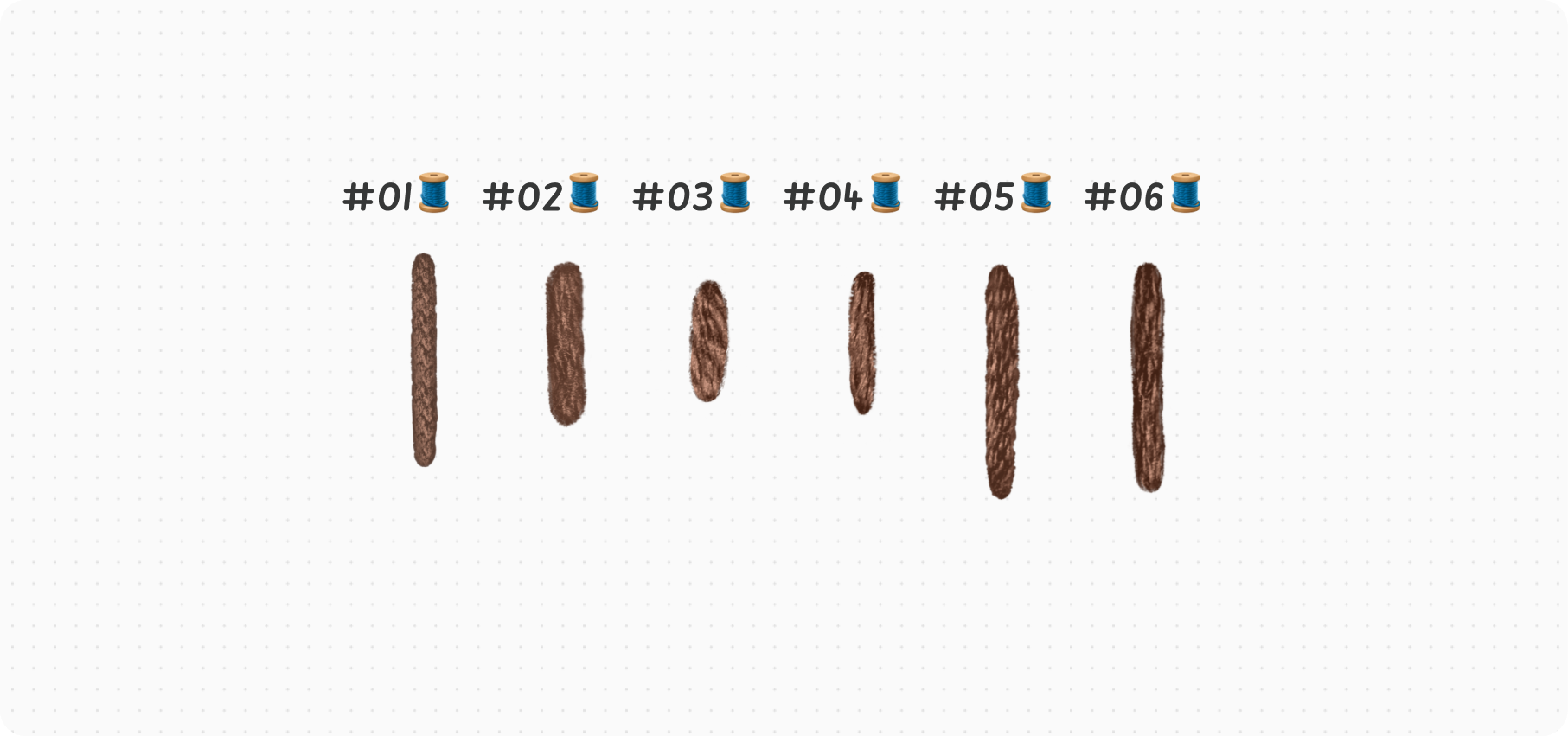
If you exclude Base, Buttons, Knots, Fly, Chain, and Canvas brush packs, the entire Embroidery Art Box collection consists of different types of stitches based on six different threads. So, if in a brush name you see #01, it means it has the same thread texture as any other brush marked with #01.
The 🧵 emoji in a brush name means it's a matte brush. This means it represents a standard thread texture, without any added shine or other special effects.

#01 — sourced from a nylon cord I got for Christmas decorating. On a side note, the Dream & Stitch collection is purely based on this one.
#02 and #04 — sourced from wool threads my lovely granny used to weave socks for me (you guessed it, for Christmas!).
#03 and #05 — sourced from Mouline threads I’ve kept handy for years for those embroidery projects I’ve always dreamed of creating (and never did).
#06 — a nameless hero, the one that popped up in the source photos, but the original thread probably got lost during my epic relocation to a new country. My hypothesis is that it was sourced from either a worn-out mouline or a handsome-looking wool thread. We’ll never know 😅.
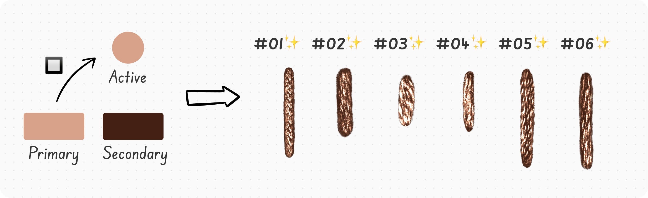
Now, what I love digital art for the most is the ability to bend reality a bit. That’s how I created those metallic versions of the above-mentioned threads. Do they match 1-to-1 any real-world threads you’d buy in an arts & crafts shop? No. Are they shiny like goldwork tapestries from the Middle Ages? Yes! And that's precisely why I love them.
Such metallic brushes are marked with the ✨emoji.
Layering 🧵Matte and ✨Metallic Brush Strokes
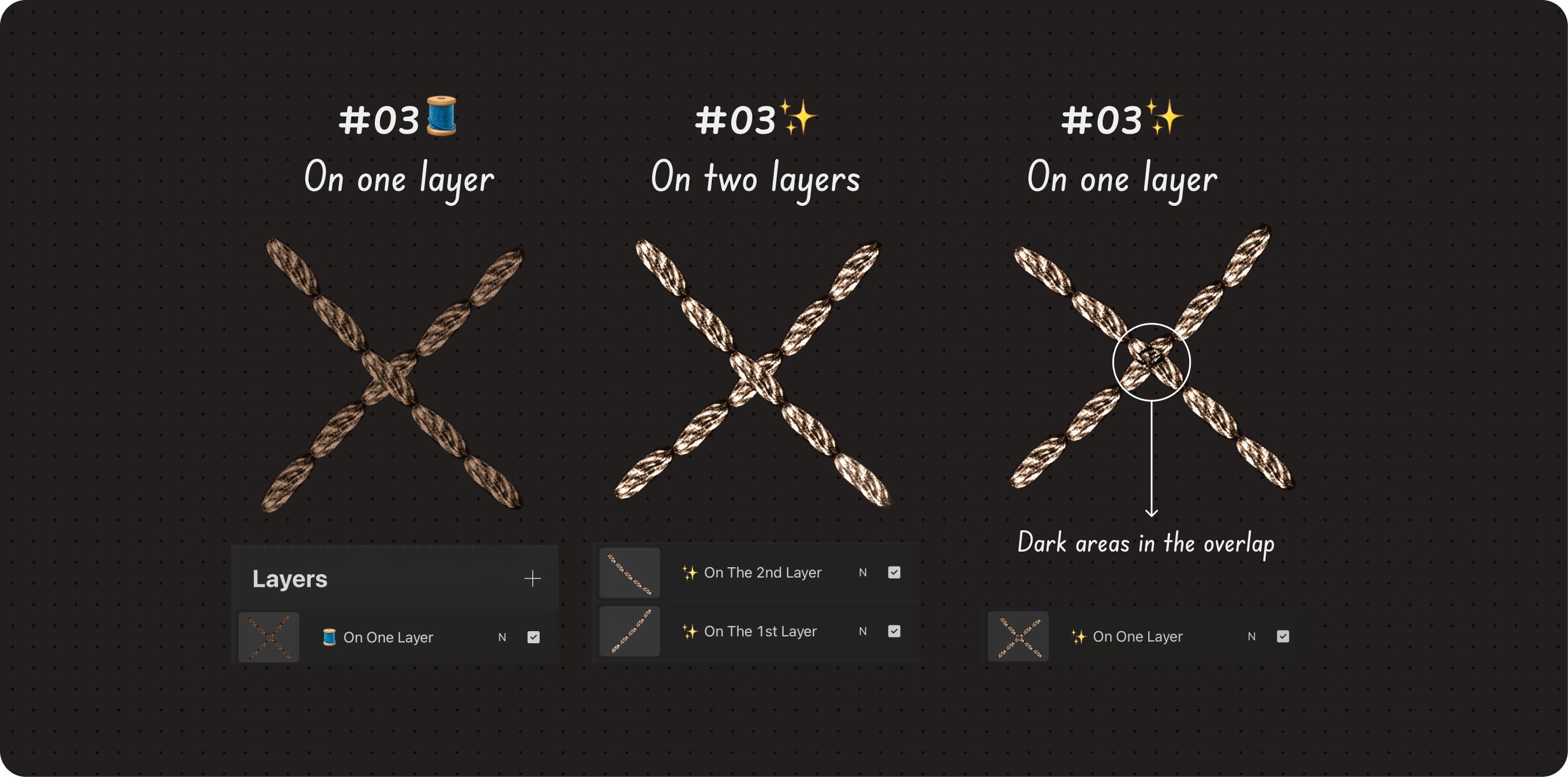
Strokes made with brushes marked with 🧵 layer well on top of each other and don't create unwanted effects. Because of this, you can comfortably work with them even on a single layer if you wish.
Strokes made with brushes marked with ✨ can sometimes create undesirable effects when layered, especially if there are lighter shades underneath. This is a byproduct of their shine. Therefore, if you are overlapping these strokes, it's best to use separate layers.
Selecting Colors
Selecting colors for digital art is hard.
Selecting two colors for a single brush is even harder.
To make this process easier, I’ve developed several ways to think about colors when working with bokettori dual-color brushes.
If you’re not sure why two colors are needed and what for, please check this guide.
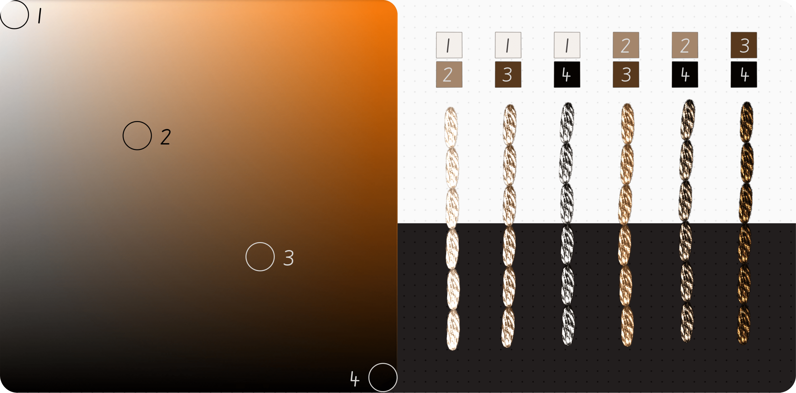
Going Diagonal
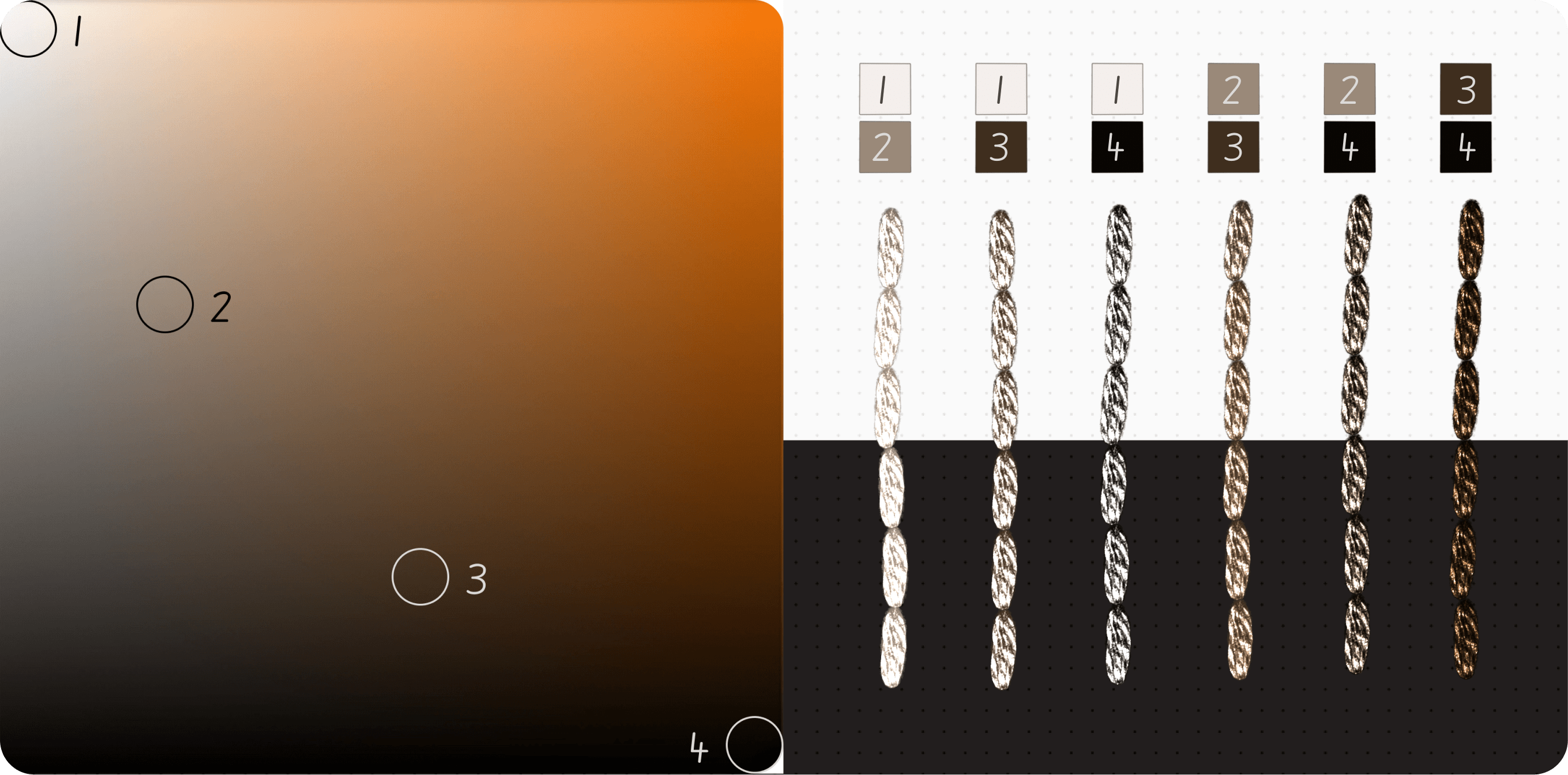
You can recreate this experiment with any hue you typically work with (or even mix several hues). For this example, I've picked orange – not because I’m a huge fan, but because oranges are key to mimicking gold :)
So, I selected four colors of the same hue lying on the diagonal from white to black. Then tested combinations of those colors using the #03🧵 back stitch brush.
As you can see, the resulting stitches are calm and somewhat desaturated.
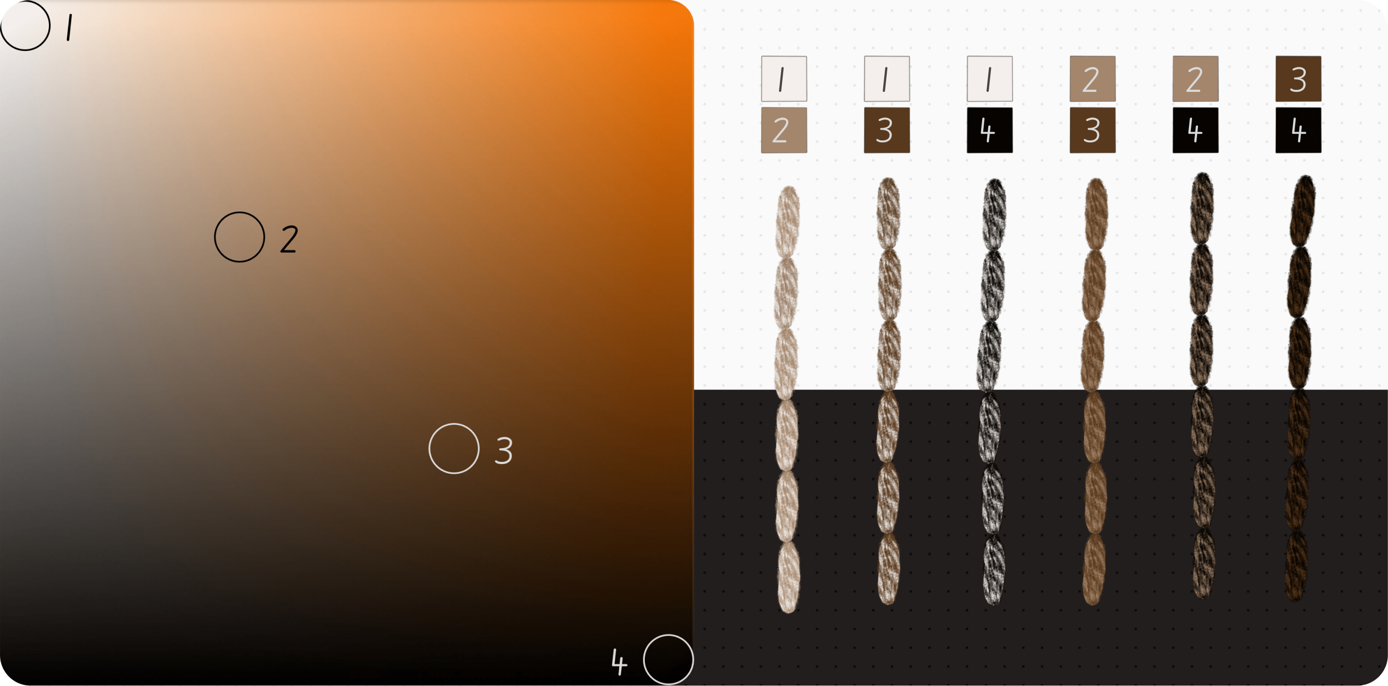
When the same exercise is done with the #03✨ back stitch brush, the result may be too harsh when two light colors are combined (1 and 2 in this case).
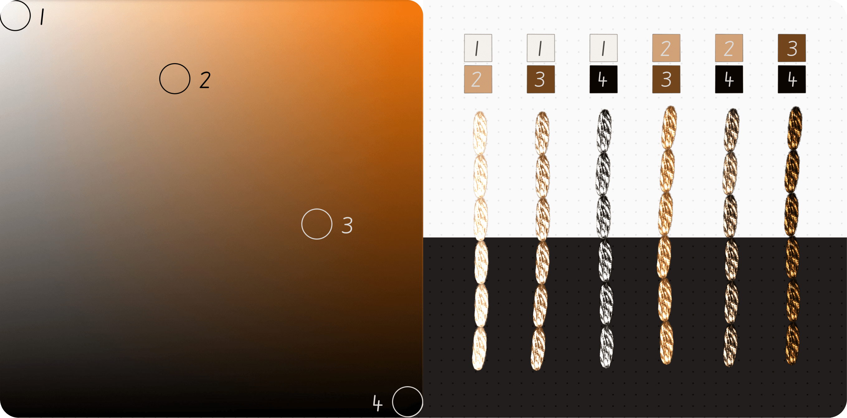
Saturation Curve
If we bend the diagonal upwards, we’ll get what I call the saturation curve. This is because this method results in more saturated colors. If you compare the stitches from the image below with their counterparts created using the #03🧵 brush in the Going Diagonal section, you'll see that the colors here are more saturated.
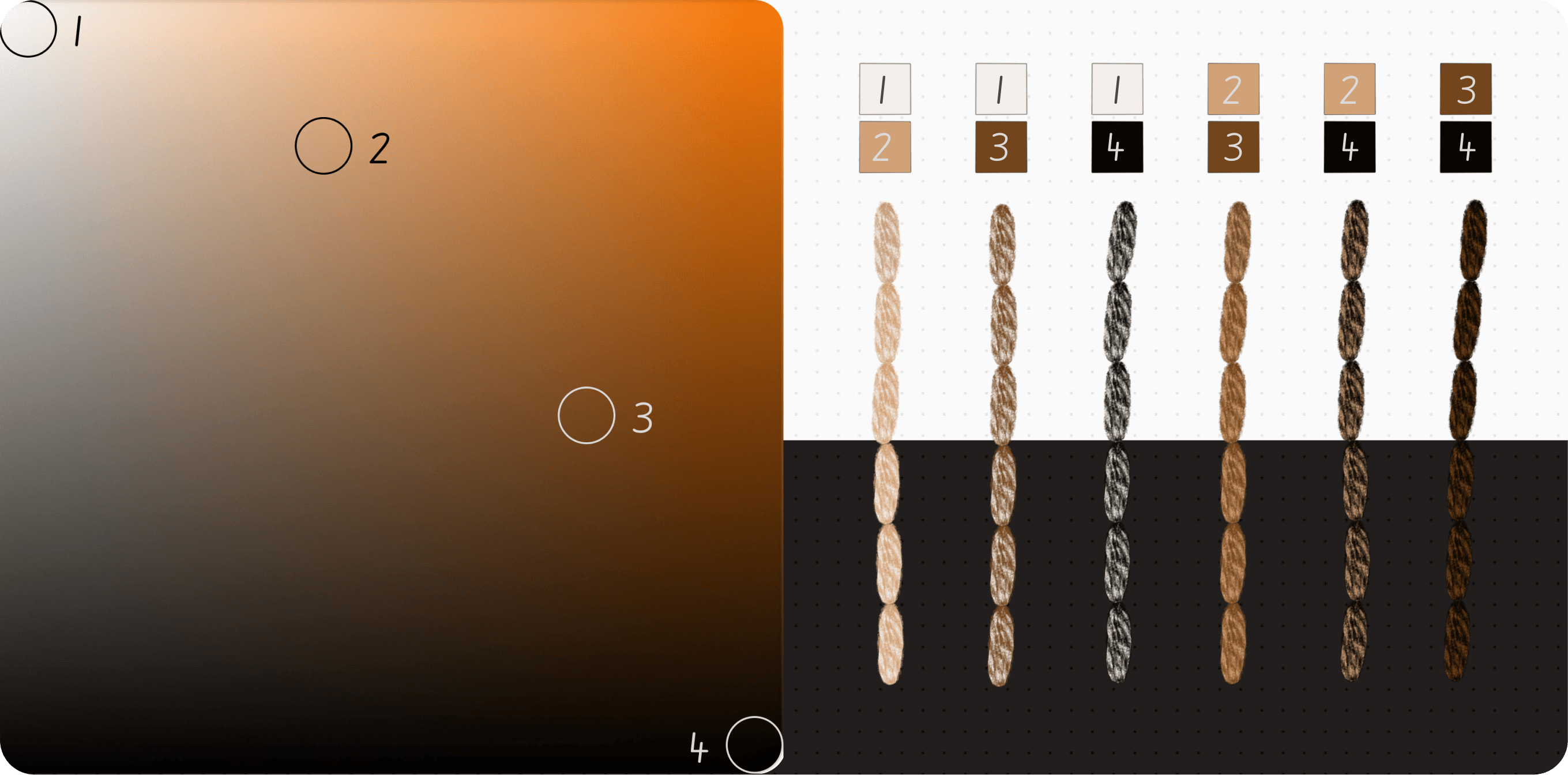
The more you bend the curve, the more saturation you’ll get.
The same logic applies when working with metallic brushes. And as in the section above, using two very light colors yields the least pleasing result.
Desaturation Curve
The desaturation curve does the opposite – colors get desaturated as the curve name suggests.
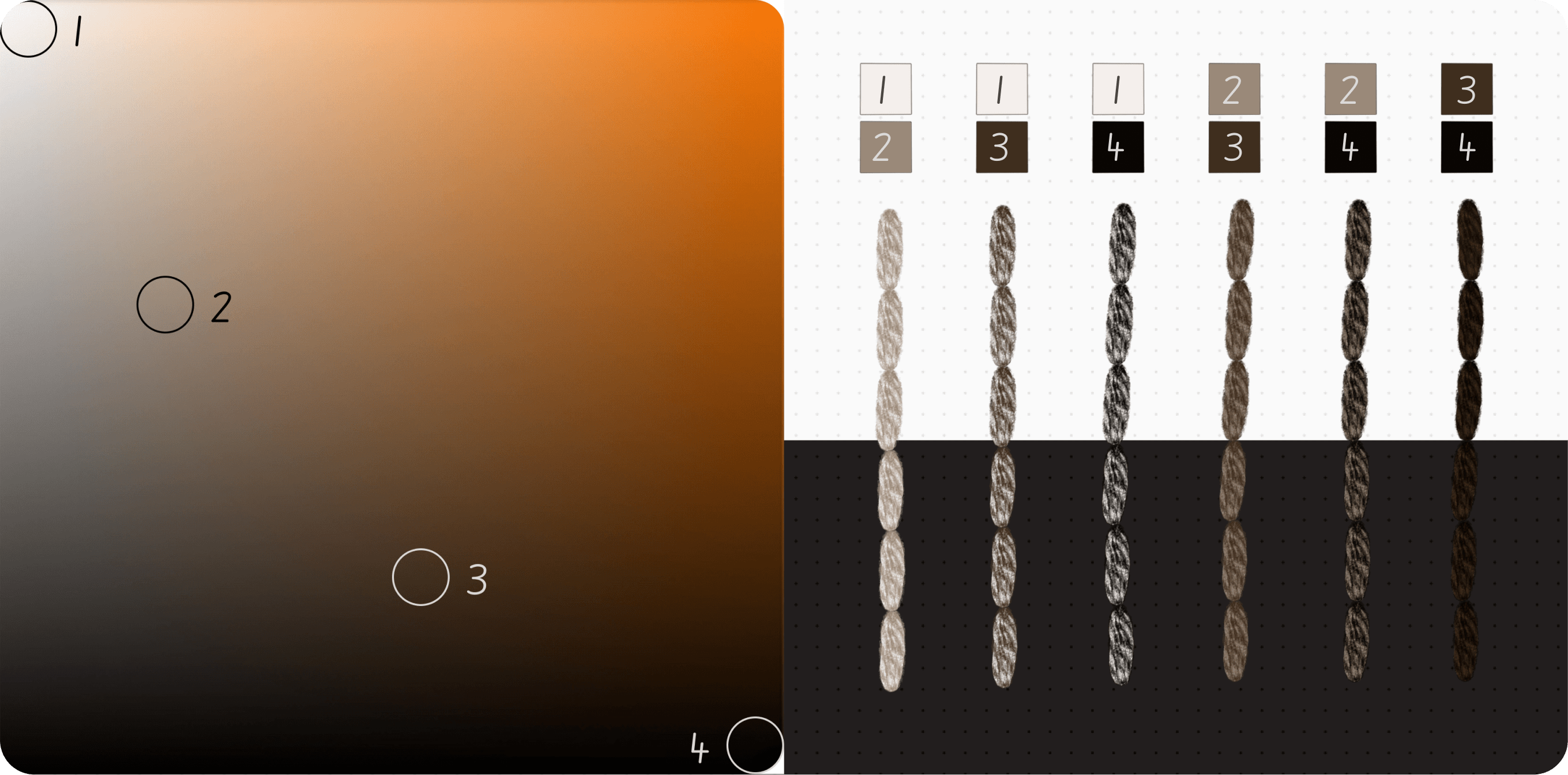
What’s worth mentioning here is that by desaturating colors, you can get colors closer to silver, platinum gold, or even dark bronze.
Extreme Saturation
Highly saturated colors are hard to tame.
And while some of the 🧵 matte color combinations are fresh and pleasing, most ✨ metallic combinations can be visually jarring. The 3/4 metallic combo might be an exception, but extreme saturation is generally challenging with these shiny effects.


Extreme Desaturation
This is how you can get grays, blacks, and silvers.


Inconsistent Colors
When working with the thread brushes, you may notice that from time to time, some annoying color inconsistencies can occur, like in the image below. See those lighter strokes appearing here and there?

Unfortunately, that’s a side effect of dual-color brushes. The way they work involves a degree of randomization, and the appearance of these overly light (or sometimes dark) stitches is a result of this.
The simplest solution is to redraw the stroke if it displays this unwanted variation.
On the other hand, I sometimes keep them intentionally to add a bit of natural color variation, especially when filling larger areas of the canvas.
Hope this was helpful!
Until next time, please feel free to leave any questions you have in the comments below.
With 💖,
Kate from bokettori