


Paper Cut Effect with Paper Tales Brushes
Your guide to crafting gorgeous layered Paper Art

Hello, creative friends! 🙌
Today, I’d like to share an easy tutorial on how to achieve a paper cut effect in Procreate.
The techniques I’ll show here are versatile and would probably work for any paper texture brushes you might have. However, this tutorial will specifically focus on using these brushes:
Step 0. Get the Files
As usual, if you’d like to follow along, grab the free brushes and the working file. Simply choose a personal license to download them completely free.
Once the free checkout is complete (you won’t need to enter any card details), three download buttons will appear. Be sure to download all files.
You’ll get:
Paper Texture Brushes:
Paper_Tales_Sample.brushset
(The brush set for this tutorial)Working File:
Paper_Cut.procreate
(This is the Procreate file we’ll be using to start the tutorial, with layers already set up for you)File with my Final Paper Work:
Paper_Cut_-_Final.procreate(You can use it for reference)
To load the brushes, just tap the .brushset file. It’ll import directly into your Brush Library.
Next, tap the Paper_Cut.procreate file to open it, and we’re all set!
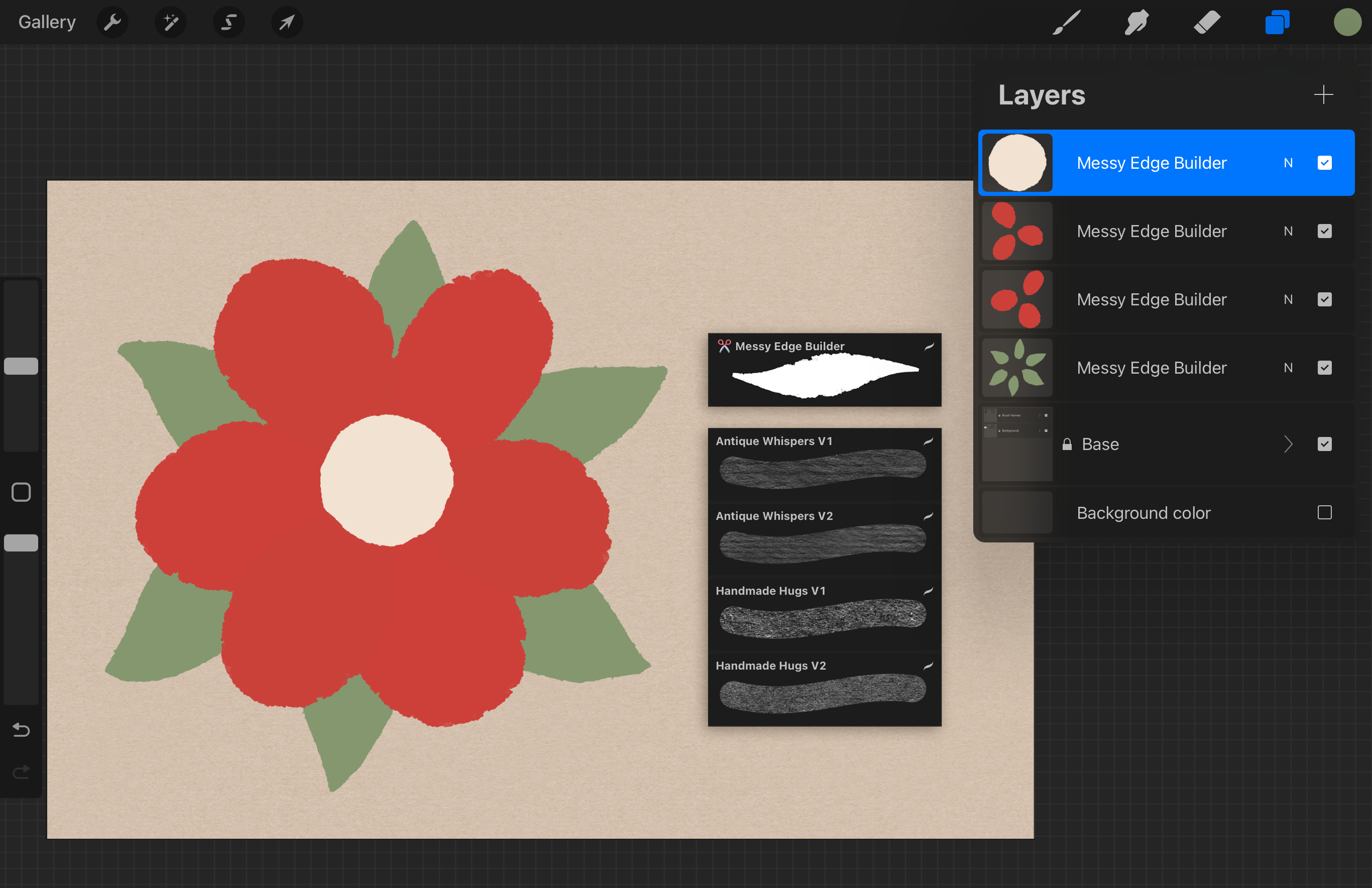
Inside the Procreate working file for this tutorial, you’ll find these pre-set layers:
Base Group: this group holds the background and the brush names for your reference. Feel free to hide it if these elements aren’t needed.
Four Flower Part Layers: each of these layers is named Messy Edge Builder, reflecting the brush I used to create the shapes. You are welcome to rename or adjust them to your preference.
Step 1. Understand the Approach
Alright, let’s start by understanding the fundamentals of creating a paper cut look.
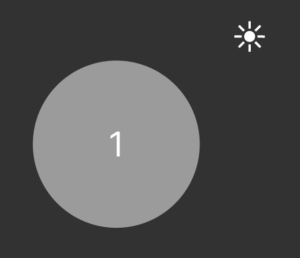
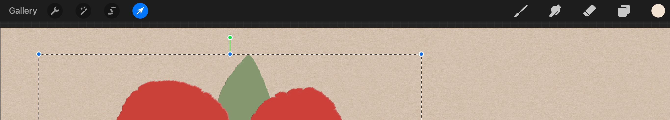
Imagine this shape 1 as the base layer of our paper piece.
And that little sun as our light source.
To make the shape appear as if it’s a cutout, we’ll be working with duplicates of this base shape, manipulating them to mimic how light and shadow interact with real paper (or anything thin lying on a surface).
Adding the Light Edge
Think about a real piece of colored paper or cardboard.
When you cut a shape out of it, you’ll notice something interesting along the cut edge.
If the color is applied mostly to the surface (like paint or a pigment), the very edge where it’s been cut often appears lighter. This is because the color doesn’t fully saturate the thickness of the paper.
We’ll be mimicking this by creating a subtle light edge along our cut shapes. This small detail adds a significant amount of realism to the final artwork.

In fact, to make things a bit easier and more cohesive, I prefer to use this light edge to mimic the highlight on the side facing the light source.
To add that highlight, we need to:
Duplicate the base shape
Position below all shapes
Lighten it a bit
Offset it slightly towards the light source (the sun icon)
This creates a subtle, shiny edge where the light hits. This underlying layer is marked with 2 on the image below.

Adding the Dark Edge
Now, let’s address another subtle detail that can really help define our shapes.
In real life, the visibility of a dark edge can vary. If the paper is very thin or is perfectly straight, you might not notice it as much.
However, for our digital artwork, adding a controlled dark edge can be a fantastic way to visually distinguish shapes and enhance that layered, cut-paper look.
To achieve this effect, we need to:
Duplicate the base shape (again)
Position below all shapes
Darken the duplicate - you want it to be a bit darker (and desaturated) than your base shape, but not too extreme.
Offset towards the shadow = in the opposite direction of the light source (the sun icon ). Just like the highlight, a subtle offset is key here.
This process creates that distinct, dark edge where the light isn’t hitting directly. If you look at the image below, this underlying dark layer is marked with 3.

But it really depends on the look you’re aiming for and adding such edge is pretty much optional.
Adding the Shadow
Finally, let’s add a subtle, blurred shadow to imitate our shape lying on a surface.
The easiest way to achieve this is by duplicating our Dark Edge layer. We’ll then position this duplicate below all other shapes and give it a gentle blur.
So, to add the shadow, we need to:
Duplicate the dark edge layer
Position below all shapes
Apply a subtle blur - the goal is to create a soft, diffused shadow that grounds your paper cutout to the canvas, giving it that three-dimensional feel
Adjust if necessary - you might want to adjust the opacity of this shadow layer to control its intensity

Summing Up
Let’s quickly recap what was done to transform that simple base shape.

To create this layered, dimensional effect, we essentially followed these steps:
Base shape (1)
Our starting point, the foundation of our paper element.Light edge (2)
We duplicated the base shape, offset it towards the light source, and applied a subtle highlight. This mimics the lighter edge often seen on real paper where light hits.Dark edge (3)
We duplicated the base shape again, darkened it slightly, and offset it away from the light source. This creates a defined edge where light isn’t present, adding to the illusion of depth.Shadow (4)
Finally, we duplicated that dark edge layer, moved it to the very bottom, and applied a gentle blur. This creates a soft, cast shadow that grounds our paper cutout to the canvas, making it feel dimensional.
This systematic layering and offsetting is the core technique we’ll be using for each of the elements in our Procreate file. By understanding this process, you’ll be able to create realistic paper cut effects with any shapes you choose.
Step 2. Creating Duplicates
Based on the workflow from the step 1, we need two duplicates for each layer.
So, let’s create them :)
Here’s a quick reminder on how to duplicate layers in Procreate.
Open your layers panel
Tap the Layers icon (it looks like a stack of squares) in the top right corner of your Procreate interface.Locate the needed layer
Find the layer you wish to duplicate in the Layers panel.Swipe left on the layer
Gently swipe left on the layer you want to duplicate.Tap Duplicate
A menu will appear, tap on the Duplicate option. A new layer will appear directly above your original layer.
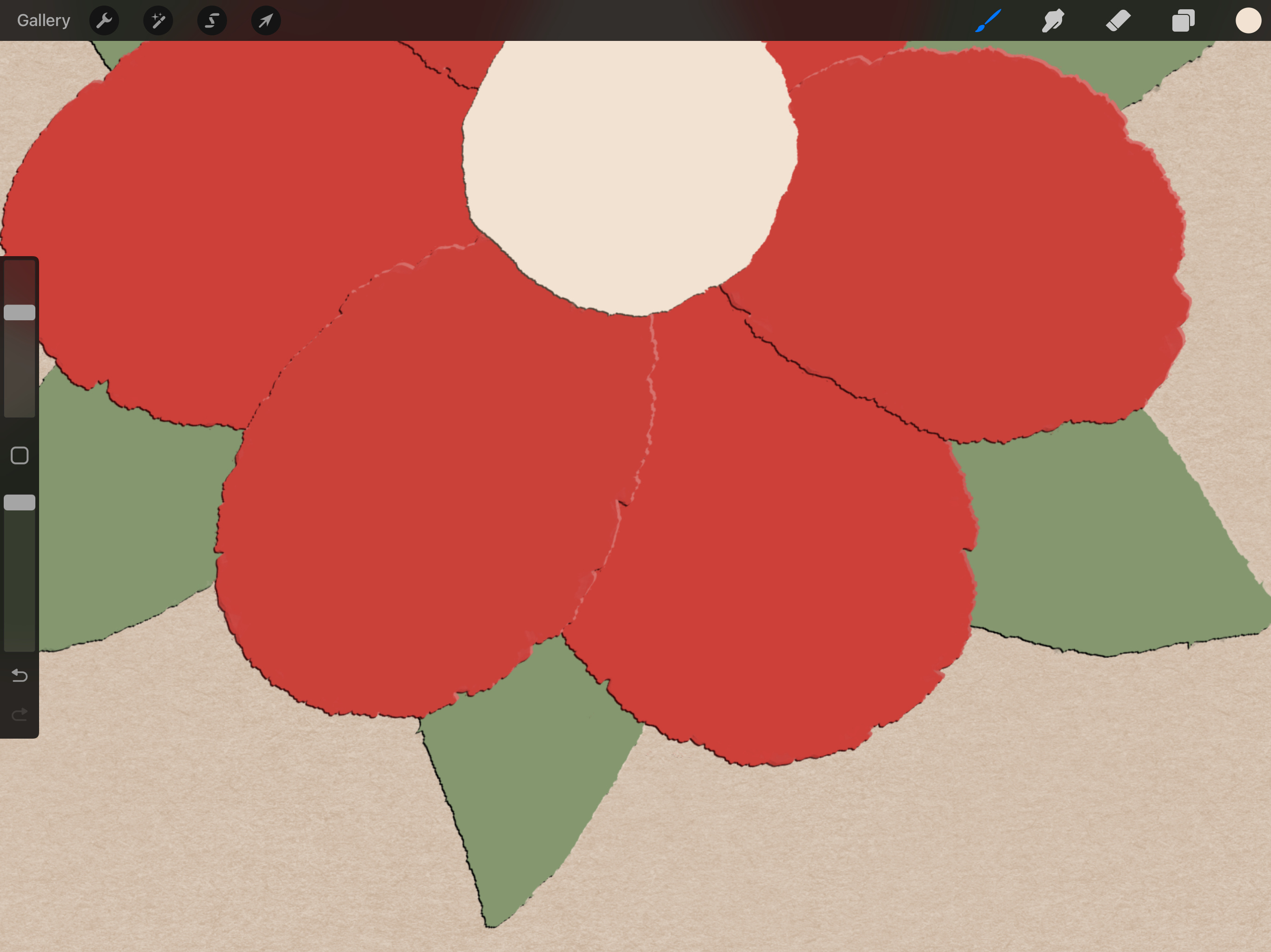
Once you apply this process to all the layers they should look like this.

They now look a bit hard to navigate, so let’s rename them.

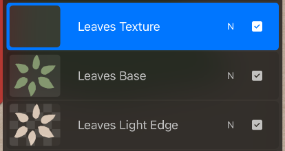
Step 3. Adding the Light Edges
Here we’ll be working with these layers:
Center Light Edge
Top Petals Light Edge
Botton Petals Light Edge
Leaves Light Edge
For each of these layers, we need to:
Lighten the color
Select the layer you’re working on and:Adjust the Hue/Saturation/Brightness
In Procreate, you can go to Adjustments (the magic wand icon) > Hue, Saturation, Brightness. Slide the Brightness slider to the right to lighten the color.Desaturate (optional)
If the colors feel too intense, you can also slightly desaturate them by sliding the Saturation slider to the left in the same Adjustments menu. This can create a more subtle and natural paper look.
Offset towards the light
With the lightened layer still active, use the Selection tool (the arrow icon) to move (offset) the entire shape slightly towards our assumed light source, which is located in the top right corner. A gentle, subtle shift is key here - you’re aiming to create the impression of a light-catching edge, not a completely new shape.
TIP: Efficiently Offsetting All Light Edges
To save you time and ensure a consistent offset for all your light edges, here’s a handy tip:
Once you have lightened all the necessary layers (Center Light Edge, Top Petals Light Edge, Bottom Petals Light Edge, and Leaves Light Edge), you can move them all together!
Select all light edge layers
In your Layers panel, swipe left on each of the light edge layers you’ve just prepared. This will select them all.
Activate the Selection Tool
Tap the Selection tool icon (the arrow) in the top toolbar.
Move them together
With all your light edge layers selected and the Selection tool active, gently move them together towards the top right (our light source direction).
To do this simply tap with your Apple Pencil in the desired direction ↗️ 2 or 3 times. This slight, repeated movement is usually enough to create a subtle and consistent offset across all the selected layers.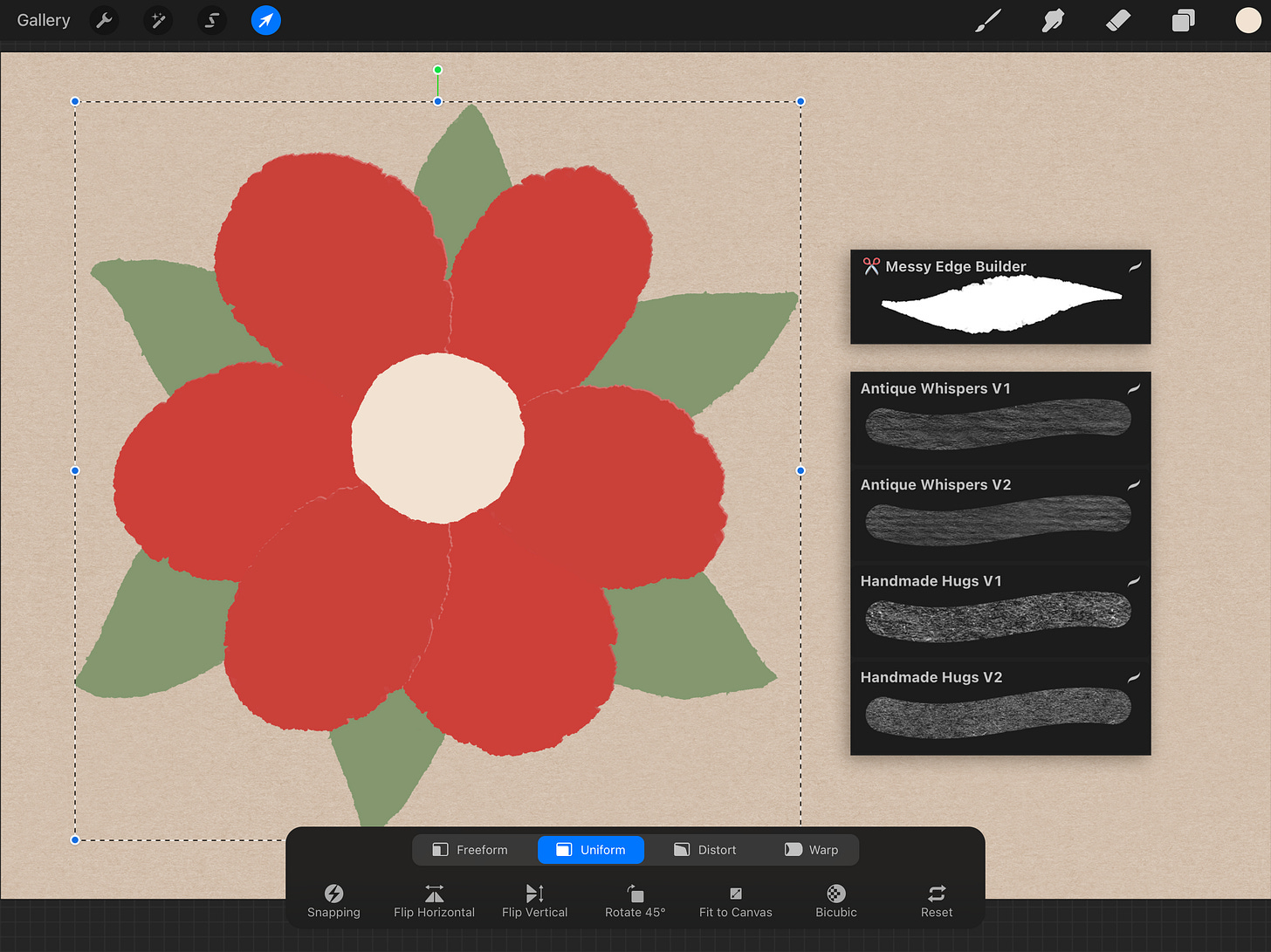


This method ensures that all your light edges are moved by the same amount and in the same direction, creating a unified look.
Step 4. Adding the Dark Edges
Now that we’ve established the light edges, let’s add the corresponding dark edges. These will enhance the sense of depth and define the forms even further by simulating the areas where light doesn’t reach.
We’ll be working with the following layers:
Center Dark Edge
Top Petals Dark Edge
Bottom Petals Dark Edge
Leaves Dark Edge
For each of these layers, we need to perform two key actions:
Darken the color
Select the layer you’re working on. Go to Adjustments (the magic wand icon) > Hue, Saturation, Brightness. Slide the Brightness slider to the left to darken the color. You might also consider slightly decreasing the Saturation if the original color is very vibrant.Offset towards the shadow
With the darkened layer still active, use the Selection tool (the arrow icon) to move (offset) the entire shape slightly in the opposite direction of the light source. Again, a subtle offset is crucial here to maintain a realistic look.
TIP: Consistently Offset All Dark Edges
Just like we did with the light edges, we can save time and ensure a consistent look by offsetting all the dark edge layers together:
Select all dark edge layers
In your Layers panel, swipe left on each of the dark edge layers you’ve just prepared. This will select them all.
Activate the Selection Tool
Tap the Selection tool icon (the arrow) in the top toolbar.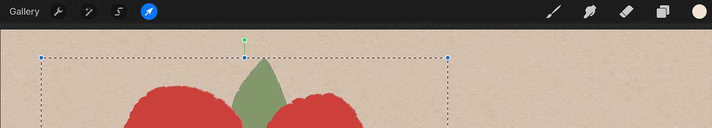
Move them together:
With all your dark edge layers selected and the Selection tool active, gently move them together in the opposite direction of the light source.
To do this simply tap in the desired direction (bottom left ↙️) 2 or 3 times.The result should look like this:


Step 5. Adding the Shadows
For this step, we’ll take our previously created dark edge layers and transform them into shadows:
Duplicate dark edge layers
For each of your Dark Edge layers (Center Dark Edge, Top Petals Dark Edge, Bottom Petals Dark Edge, Leaves Dark Edge), duplicate them.Rename the duplicates
Rename these new duplicate layers to reflect their new purpose:Center Shadow
Top Petals Shadow
Bottom Petals Shadow
Leaves Shadow

Note: It’s crucial to keep these shadow layers below all the other layers within their respective groups (Base, Light Edge, Dark Edge). This ensures the shadow appears underneath the paper element.
Apply a subtle blur
We need to apply a bit of blur to these new layers to create a soft, diffused shadow effect. Procreate doesn’t currently support blurring multiple layers simultaneously.
This means we’ll need to apply the blur to each shadow layer individually.For each Shadow Layer:
Make sure the shadow layer is selected.
Go to Adjustments (the magic wand icon) > Gaussian Blur.
Use the slider to apply a subtle blur. Aim for a soft, diffused shadow that grounds the paper element without being too harsh or defined (about 2-3% will do).
Tap outside the adjustment to commit the blur.
Repeat this process for all four shadow layers. You can experiment with the blur intensity until you achieve a look that feels right for your artwork.


(Optional but recommended) Set blending mode to Multiply
To enhance the realism of your shadows, consider setting the blending mode for each shadow layer to Multiply.
In the Layers panel, tap the N icon (which usually stands for Normal) on the shadow layer. From the dropdown menu, select Multiply.

This blending mode will allow the shadow color to interact more naturally with the colors beneath it, creating a softer and more integrated shadow effect. You can adjust the opacity of the shadow layer as needed after changing the blend mode.
Step 6. Adding the Paper Textures
Finaly, the fun part! 🥳
We’ll be applying paper textures to our Base Layers (the original shapes, not the highlights, dark edges, or shadows).
Here’s how to do it:
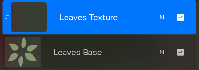
Create new layers for texturing
For each of your original Base layers (e.g. Center Base, Top Petals Base, etc.):Add a new layer
Create a new layer directly above the base layer you’re about to texture. For that tap on the + icon in the layer panel. And rename it for clarity.
New layer created on top of the Leaves Base layer Clip the new layer
Tap the layer thumbnail for this new layer and select Clipping Mask.
This ensures that whatever you draw on this clipped layer will only appear within the boundaries of the base layer below it.
That little arrow tells us the texture layer is clipped
Apply the texture
Now, for each base layer and its corresponding clipped layer:Select the base color
Long tap on your base layer to sample its original color.
Adjust the Color
Darken it
Make the sampled color slightly darker.Increase saturation (optional)
You might also want to make the color a bit more saturated to help the texture stand out against the base color.
Choose your texture brush
Select one of the paper texture brushes.
Draw the texture
On the clipped layer, draw with your chosen texture brush (increase the brush size to make it easier). You can draw multiple times to layer the textures and enhance the effect.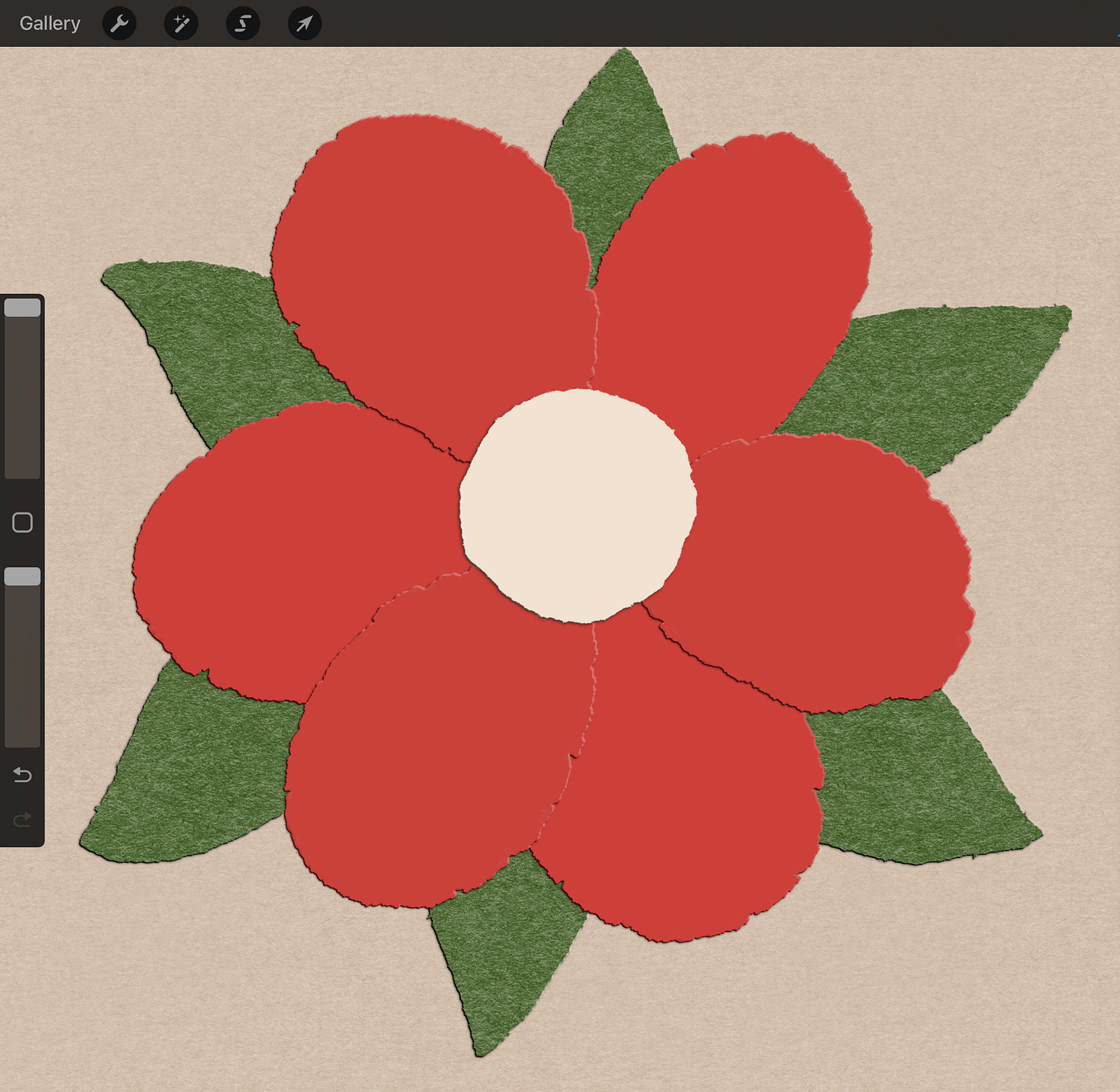
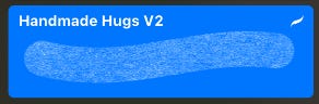
Handmade Hugs V2 layered three times


Don’t forget to repeat this process for all your base layers!
